The Role of Color in Abstract Paintings: Psychological and Emotional Impact
Color is a fundamental element in abstract paintings, serving as a powerful tool for conveying emotion and meaning.
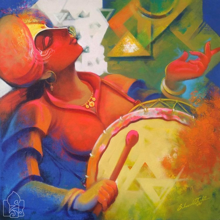
Color is a fundamental element in abstract paintings, serving as a powerful tool for conveying emotion and meaning. Unlike representational art, which relies on recognizable forms and subjects, abstract art uses color to evoke psychological and emotional responses. The absence of identifiable imagery allows color to take center stage, influencing how viewers perceive and interact with the artwork. This article explores the role of color in abstract paintings, examining its psychological and emotional impact and how it shapes our experience of art.
The Power of Color
Psychological Effects of Color
Colors have long been studied for their psychological effects on the human mind. Different colors can evoke various emotions and states of mind, influencing mood and perception. Here are some common associations with basic colors:
- Red: Often associated with passion, energy, and intensity. It can evoke feelings of excitement or even aggression.
- Blue: Generally linked to calmness, tranquility, and stability. It can also evoke feelings of sadness or contemplation.
- Yellow: Associated with happiness, warmth, and optimism. However, in large amounts, it can also cause feelings of anxiety or frustration.
- Green: Connected to nature, growth, and renewal. It often evokes feelings of harmony and peace.
- Purple: Often linked to mystery, spirituality, and luxury. It can evoke feelings of introspection and creativity.
- Orange: Associated with enthusiasm, creativity, and vitality. It can evoke feelings of warmth and excitement.
- Black: Linked to power, elegance, and mystery. It can evoke feelings of sophistication or melancholy.
- White: Associated with purity, simplicity, and peace. It can evoke feelings of clarity and openness.
Emotional Resonance
In abstract paintings, the emotional resonance of color is amplified by its context within the composition. The way colors interact, their placement, intensity, and saturation all contribute to the overall emotional impact of the artwork. Artists use color not just to represent emotions but to evoke them directly in the viewer.
Techniques for Using Color in Abstract Art
Color Harmony and Contrast
Artists often use color harmony and contrast to create visual interest and evoke specific emotional responses. Color harmony involves using colors that complement each other, creating a sense of balance and unity. For example, analogous colors (those next to each other on the color wheel) can create a harmonious, soothing effect.
In contrast, artists may use complementary colors (those opposite each other on the color wheel) to create visual tension and excitement. This contrast can draw the viewer's eye and evoke dynamic emotions.
Saturation and Value
The saturation (intensity) and value (lightness or darkness) of colors also play crucial roles in abstract paintings. Highly saturated colors can evoke strong, vibrant emotions, while desaturated colors can create a more subdued, reflective mood. Similarly, variations in value can add depth and dimension to the artwork, influencing how viewers perceive the composition.
Color Temperature
Colors are often described as warm or cool based on their visual temperature. Warm colors (reds, oranges, yellows) tend to evoke feelings of warmth and energy, while cool colors (blues, greens, purples) are associated with calmness and relaxation. Artists can use color temperature to create spatial effects, with warm colors appearing to advance and cool colors receding, adding depth to the painting.
Case Studies: Mastering the Emotional Language of Color
Mark Rothko
Mark Rothko, a prominent abstract expressionist, is renowned for his use of color to convey profound emotional experiences. His large-scale paintings often feature horizontal bands of color that seem to float against a background. Rothko's use of color was meticulous; he believed in its power to communicate deep emotional states directly to the viewer. His works like "No. 61 (Rust and Blue)" demonstrate how color can evoke a sense of contemplation, sadness, or transcendence.
Wassily Kandinsky
Wassily Kandinsky, one of the pioneers of abstract art, explored the spiritual and emotional effects of color. He believed that colors had inherent psychological and emotional properties and that they could be used to create a "spiritual vibration." Kandinsky’s works, such as "Composition VII," use vibrant, contrasting colors to create a dynamic and emotive experience, reflecting his synesthetic perception of color and sound.
Helen Frankenthaler
Helen Frankenthaler, a leading figure in the Color Field movement, used a technique known as "soak-stain," where she poured thinned paint onto unprimed canvas. This method allowed colors to soak into the fabric, creating luminous, translucent effects. Her work "Mountains and Sea" exemplifies how subtle color transitions can evoke a sense of landscape and emotion without representing actual forms.
Interpreting Color in Abstract Paintings
Personal Response
Interpreting color in abstract paintings is inherently subjective. Each viewer brings their own experiences, memories, and emotions to the artwork, which influences how they perceive and respond to color. For example, a particular shade of blue might evoke a sense of peace for one viewer, while reminding another of a sad memory.
Contextual Analysis
Understanding the context in which a painting was created can also inform its interpretation. Knowledge of the artist’s intentions, the historical and cultural background, and the specific artistic movement can provide insights into the use of color. For instance, the vibrant, expressive colors used by abstract expressionists in the mid-20th century often reflect the intense emotions and existential concerns of the post-war era.
Symbolism and Metaphor
In some abstract paintings, colors may carry symbolic or metaphorical meanings. Artists might use specific colors to reference cultural or personal symbols. For example, black and white might be used to symbolize duality or conflict, while gold could represent spirituality or the divine.
The Universal Language of Color
Color in abstract paintings functions as a universal language, transcending cultural and linguistic barriers. While the specific interpretation of colors may vary among individuals and cultures, the emotional impact of color is a shared human experience. This universality allows abstract art to communicate on a fundamental, emotional level, making it accessible to a wide audience.
Engaging with Abstract Art
To fully appreciate the role of color in abstract paintings, viewers should engage with the artwork on both an intellectual and emotional level. Take time to observe the interplay of colors, reflect on your emotional responses, and consider the broader context. By doing so, you can unlock the rich psychological and emotional depths that abstract art offers.
Conclusion
The role of color in abstract paintings is central to their psychological and emotional impact. Through careful use of color harmony, contrast, saturation, value, and temperature, artists can evoke a wide range of emotions and states of mind. By engaging with abstract art and exploring the powerful language of color, viewers can experience a profound connection with the artwork, uncovering layers of meaning and feeling that might otherwise remain unseen.
What's Your Reaction?


![Blog Submission Sites 2024 [High DA]](https://blognow.co.in/uploads/images/202306/image_100x75_6494a03eaff5e.jpg)
![Article Submission Sites 2023 [High DA & PA]](https://blognow.co.in/uploads/images/202307/image_100x75_64c4181f17036.jpg)
![Classified Submission Sites 2023 [High DA & PR]](https://blognow.co.in/uploads/images/202306/image_100x75_649dcd5260808.jpg)


![Article Submission Sites 2023 [High DA & PA]](https://blognow.co.in/uploads/images/202307/image_750x415_64c4181f08ed5.jpg)
![Classified Submission Sites 2023 [High DA & PR]](https://blognow.co.in/uploads/images/202306/image_750x415_649dcd5247eeb.jpg)
![Blog Submission Sites 2024 [High DA]](https://blognow.co.in/uploads/images/202306/image_750x415_6494a03e96bfa.jpg)
